Sunday, June 14, 2015

Sarah Burton for Alexander McQueen .. men's spring 2016


Whether this collection is to my liking is totally beside the point. What Sarah Burton demonstrates so skillfully here is that so called trends, inspirations and signatures can be effectively put to use without looking like a freak show or the 4th ring of a 3 ring circus.

Obviously there is a navigational, map, marine, discovery undercurrent here and the cartoonish “drawn on “medals, as in “admirals brass n braid,” of which the technique is  a continuation that we have seen for a few seasons now in both women’s and men’s. Then there is this pajama trend that seems to be so called ”trending” and again it is so much less offensive here than in what we have seen so far. There are mill engraving prints which fit perfectly with the PJ theme and then the balls out graphic prints which are polar opposites of each other. One could say that McQueen is full of contradictions but always travelling a straight line. Oh yes, and let’s not forget the barbed wire print which is utilized so deftly as to just accept without question of any inferences, connotation or implication.


A discussion of fashion these days would not be complete without the topic of so called gender bending or what comes to mind is unisex! Bracelet or ¾ length sleeves, ruffles, spencer jackets, cropped pants and even culottes look strangely at home in this collection. Once again, this is not luck; this is unadulterated skill that enables Sarah Burton to unleash a collection like this. Much of what is shown owes a great debt to the fact that the collection is NOT over styled. So many who have already shown or might have infused a collection like this with either naval personnel images or worse yet Captain Hook interpretations which would land the collection in the design school project category.  There is no mistake here in that this is business and not some design student’s idea nor some stylists wet dream of what spring 2016 should look like.


Kudos to SB... BTW there are some amazing pieces here once a collection like this is dissected and examined and yet is the sum of its parts that is thematic and not necessarily each piece! And the tailoring sublime

Wednesday, June 10, 2015

Marc Jacobs resort 2016


The pigs just flew by AGAIN!!! Like it? No?? .. Get it?  .. Well yes I do for the first time in a long time. The press release might have alluded to the influence of Diana Vreeland, but my eyes told me this is much more Frida Kahlo and south of the border than ediatrix! From the “slab” of brow to the head scarfs to the embellishments, for me this was a lot of Cinco de Mayo, minus the serape colors, and not so much NYC and fashion capitals.


Jacobs utilized some of the most classic elements of historical resort collections with some heavy usage of broderie anglaise and various other laces mixed up with nautical stripes and lot of decoration. One might say you were reminded of Gaultier, Prada, come Japanese and some Lagerfeld. Sailor pants, mariner stripes, the high stance collars, the mirrors and those mutant peter pan collars all mixed up into a bouillabaisse of a Marc Jacobs collection. It can be said that for once in a long time, the clothes actually look like people would wear them and not look like they were off to some odd costume party.

The restrictive palette enhanced not only the embellishments but heightened the seriousness of the clothes. These were not kittenish costumey get ups that are a rule here but a more citified sophisticated side of Jacobs. Personally, I found the prints very uninteresting to be honest and the one shoulder feather pieces were so reminiscent of “someone” whose name escapes me.


No matter, all my blah blah blah, I found the clothes intriguing and rather than dismiss them as folly, they were worth a second look and definitely not the usual fare that is offered by Marc Jacobs. There comes a time when designers have an epiphany that their clothes must sell and not just be admired or editorialized.

Tuesday, June 9, 2015

Mugler by David Koma .. resort 2016


It has been about a year since David Koma has taken the reins of Thierry Mugler now known as Mugler. In this short span of time, he has managed to do what so few of his peers have done or are even capable of and that is... he has created a signature, a look that actually has “brand recognition.” Don’t get me wrong here, yes, there are looks that might be confused for earlier Donatellamommamia pieces or yore but Koma pulls it all together as a collection that is Mugler.


Without dwelling on the DNA of the brand, it is evident to the trained eye, and there aren’t many these days who review, that this particular vocabulary of the Thierry era is present in a reimagined way. As said, Koma respected what was and transforms it into what is and that my friends takes talent, skills and vision.


The clothes retain that edge, not the fashion trend edge, but the edge that results from slick hard lines and great precision whether in dressmaking or tailoring. The now signature of the cut outs with some hardware detail is effective and again becoming a trademark of the collection. This trademark is what allows the clothes to be easily identifiable and has nothing to do with whether you like the collection or not. These are not generic clothes that seeming come from the “citywide communal workrooms” that apparently hatch collections in New York, Paris and Milan.


This season the clothes are more graphic with bold stripings and then there is what I call a scribble print which is apparently engineered to be body conforming. The color range goes the harshest and starkest of black and white played against the ice cream pastels that will no doubt appear again for Spring 2016. Once again the viewer is reminded that Thierry Mugler was indeed an architect of fashion as well as a designer who lived the precision of cut married to the art of fashion infused with sexiness. Koma seems to have a great deal of that esthetic and to his credit he utilizes it in the most appealing and modern way without looking dated or retro. Imagine not having a boat load of blah blah blah to make up for ugly clothes!


In short, to me, David Koma has reinvigorated the brand with a fresh look while retaining so much of the past. Koma has achieved what so many of his peers eschew in exchange for taking the easy way out and ignoring the DNA of a blue blood brand and replacing it with some half assed generic trendoidal vision of fashion and yes of course accompanied with some incoherent meandering treatise fueled by ego and faux intelligentsia yet has nothing to do with the clothes..

Sunday, June 7, 2015

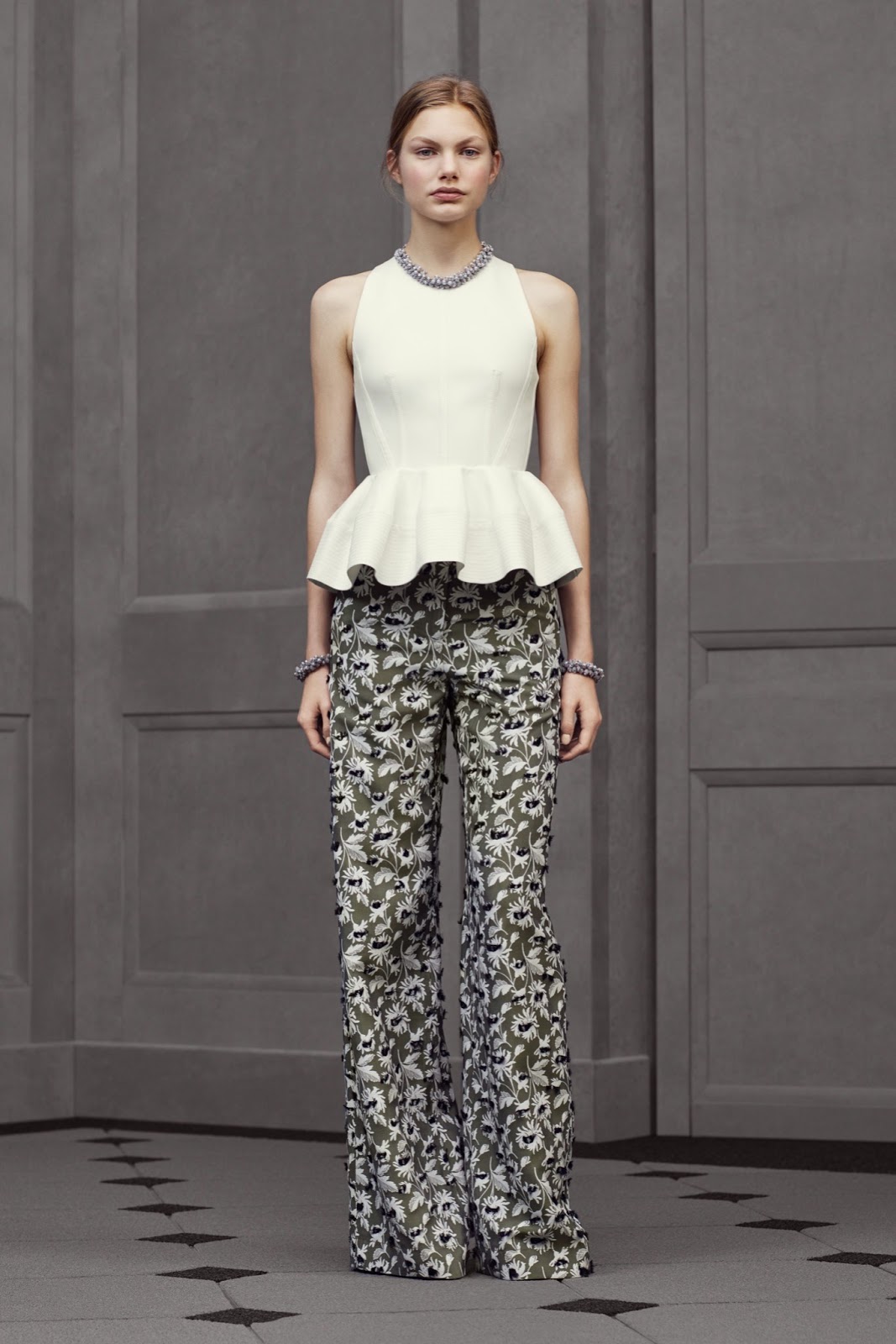
Balenciaga by Alexander Wang for resort 2016


Love it? Not a chance in hell!  … BUT … as time goes by Wang is slowly developing a signature for the brand which as nothing to do with his predilection for space aged fabrics, neoprene or pleather. What is most disturbing to the eye is that the quality is surely not up to snuff not is the construction. Please take note of the top stitching on the cream pinstripe pieces and then some of the dart placements and executions on the bodices of dresses.


If one is versed in the genuine Balenciaga one knows that part of his fame and renown came from the apparent simplicity of his designs and the smooth lines and how he was able to coax fabric into doing unimaginable things.  Now we have Wang who thinks that trapunto stitching is the only way to make a peplum “wave” or that dresses need to look the same on the hanger the same as they do with a body in them. It would most easily be said ... over designed and over conceived which is usually a result of not knowing WTF you are doing aka lack of technical skills and knowledge!


Then of course there are a group of styles that range from hideous to heinous like the apron front dresses, some limp rags with sheer insets,  and some styles that look more like undergarments rather than outer garments and yes I get, it is resort and that’s  his swimsuit/beach salute but you gotta make up your mind .. Are you in the innate DNA or in the future signature?  It can’t be retro and current or at least it can’t look that way but that requires huge skills! Then of course there is that cheap shot with the brand name on a skirt/sarong/ beach cover up... so so not becoming to the heritage and legacy of the brand.


There are about 6 to 8 pieces which are good and maybe even one or 2 that are great but that’s where it stops. Once again, it’s about having a clear cut vision for the brand and not winging it season after season by tossing in some heritage influenced styles mixed with your own version of how you imagine the brand. One of the things that MUST go is that “Sam you made the pants too long” length which is so NOT Balenciaga!


In my mind and probably in reality, some of the crap sells and probably sells well but it has nothing to do with Cristobal and his talents nor with anyone looking to buy a piece of history.